How to create a fundraising page that people actually donate to
See how content creators make money through subscriptions, tips, sponsorships, courses, and direct sales across platforms and owned channels.
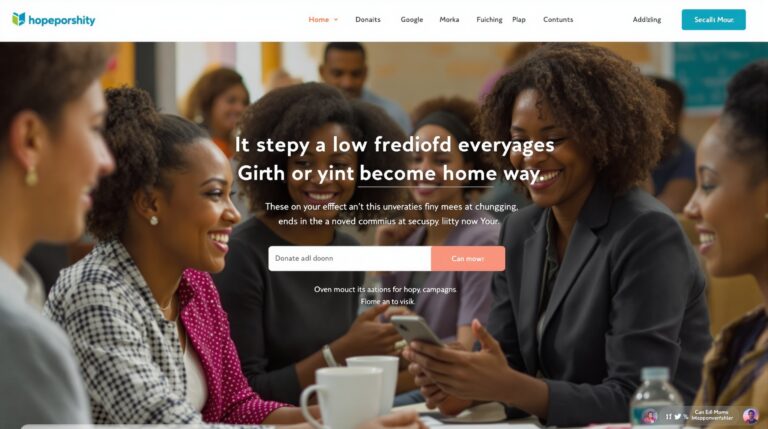
A fundraising page interface showing a clear donation goal, progress bar, and campaign story on a website
Quick answer
A fundraising page does not win donations by sounding inspiring. It wins when a stranger can scan it and instantly understand who needs help, what the money changes, and why the page feels safe enough to trust. If your page is flat, the fix is usually not more copy, it is better order, clearer proof, and a donate flow that stays visible. This guide shows the block order, the trust cues, and the common failure points that make good causes lose money.
For neutral context, this guide cross-checks the topic against Creator economy and Goldman Sachs Research's creator economy outlook. So the recommendation is grounded in external market signals rather than only product claims.
Before you write a line, decide what the page must do in the first 10 seconds. A visitor should be able to name the cause, see the proof, and find the button without working for it. That is the difference between a page that merely exists and a page that collects donations.
What leaders usually miss about a fundraising page
Most advice stops at “tell a compelling story.” That sounds helpful, but it is not enough to build from. A fundraising page is not a poster or a social post. It is a decision path with a short deadline, and the visitor is scanning for risk before they scan for emotion.
That matters because not every fundraiser needs the same emphasis. A family emergency page needs urgency and clear use-of-funds detail. A nonprofit campaign needs transparency and follow-up. A creator or community fundraiser often needs proof that the work will continue after the first gift. Pages that ignore those differences can look polished and still convert badly.
The real job is to remove three hesitation points fast: who is involved, what the money does, and what happens after the donor clicks. If any one of those stays vague, the page forces the donor to do the work that the page should have done.
For teams that run recurring campaigns, donor updates, or tiered support, this is where a branded system like Scrile Connect becomes more than a form. The page is only one layer of the process; the other layer is what happens after the donation. That is why the page itself has to be structurally strong before you worry about promotion.
What makes a visitor stop and consider donating
On arrival, the first task is not persuasion. It is stopping the scan. A weak page reads like a wall of sentiment. A strong one gives a reason to care in one glance, then backs it up with a visible cue that the situation is real.
In practice, visitors decide whether to stay in just a few seconds. If the headline is vague and the image looks generic, the rest of the page is already fighting uphill.
Headline criteria for a fundraising page
A good headline does four jobs at once: it names the cause, narrows the scope, signals urgency, and avoids sounding like a slogan. “Help us cover emergency vet care for Luna” works because it is specific and human. “Support our mission” does not, because it hides the actual ask.
Strong headlines usually include a named person, project, place, or outcome. Weak headlines lean on comfort words like “hope,” “dream,” or “change” without saying what changed and for whom. If the first line could fit fifty different campaigns, it is too broad.
That precision is not cosmetic. A vague title often loses the first wave of donors before they even scroll. The headline is the first trust test, so it should tell the reader exactly what page they are on.
Hero image or video criteria for a fundraising page
The hero visual should show the real subject of the fundraiser, not a stock image that only matches the theme loosely. A hospital bill does not need a smiling handshake photo. A neighborhood cleanup does not need a generic sunset banner. Donors read those shortcuts as low trust.
Use a visual that proves proximity to the issue. If the campaign is about a person, show the person. If it is about a project, show the project in motion. If privacy is a concern, crop the image or use a partial shot, but keep it real. A truthful but imperfect photo usually beats a polished image that feels borrowed.
One practical rule works well: if the visual does not explain the page in three seconds, it is probably the wrong visual. That rule cuts guesswork and keeps the page honest.

When a campaign has to run multiple pages, updates, and donor tiers, the visual is not just proof. It becomes part of the content system. That is one reason platforms in the nonprofit fundraising platforms category are judged on how well they support ongoing storytelling, not only the first donation form.
| Page block | Owner | Purpose | Failure signal |
|---|---|---|---|
| Headline | Campaign owner | State who needs help and why now | Too broad to identify the cause in 5 seconds |
| Hero image or video | Content lead | Prove the campaign is real | Stock image or unrelated visual |
| Summary / ask block | Copy editor | Explain the donation ask in one pass | Missing amount, goal, or use of funds |
| Story block | Founder or organizer | Give context and urgency | Too long before the ask appears |
| Trust block | Operations or finance | Show how money is handled | No transparency on where funds go |
| Donate CTA | Design / CRO | Make the next step obvious | Button buried below the fold |
The page order that reduces hesitation
Ignore the order and the page starts leaking donors. The cleanest fundraising pages usually move in this sequence: headline, visual, short ask, story, trust, then donate button. That is not a creative preference. It is a friction choice.
When the ask appears too late, visitors scan past it. When the trust block is missing, they hesitate. When the donate button is hidden under a long story, the page acts like a brochure instead of a conversion asset.
Summary / ask block
The summary block should answer three things immediately: what is being raised, how much is needed, and what the money does. Keep it short. One paragraph is usually enough. If you need three paragraphs to explain the ask, the page is already too slow.
A weak summary says “We appreciate any support.” A stronger one says “We are raising $12,000 to cover emergency treatment, transport, and recovery care over the next six weeks.” The second version gives the donor a real frame for the size of the problem.
Story block
The story block is where context earns the donation. It should explain how the fundraiser started, why the need exists, and what will happen if the goal is reached. Do not write it like a grant application. Write it like a person asking for help while still respecting the reader’s time.
Short paragraphs are not just a style choice here; they are a conversion tool. Dense text slows the scan, especially on mobile. In donor pages, the story usually works best when it stays under about 500-700 words unless the campaign is unusually complex.
If the page has no clear story arc, it falls back on emotion alone. That gets attention, but not trust. A good story gives the donor a path from problem to outcome.
Trust and transparency block
Trust is not one thing. It is a stack. It starts with who is running the campaign, then moves to how funds will be used, then ends with what updates donors can expect after giving. The best pages make that stack visible instead of leaving it implied.
Add specifics: who receives the money, when updates go live, whether receipts are issued, and whether the campaign owner can be contacted. If there is a nonprofit behind the page, name it. If there is a fiscal sponsor, say so. If funds are earmarked, say how.
Without that block, the donor has to guess. Guessing is expensive. Pages that omit basic transparency often lose people who were otherwise ready to give.
Donate CTA block
The donate button should appear where the reader has enough context to act, not after the page has exhausted them. One button near the top, one after the story, and one near the bottom is usually enough. More can feel pushy; fewer can make the page hard to use.
Placement matters more than color. A visible, repeated button with consistent label text reduces friction. “Donate now” is fine. “Support this campaign” is fine. What does not work is a button that looks decorative or changes label language halfway down the page.
Pages that bury the CTA beneath updates, FAQs, or share tools usually lose the impulse donation. The visitor had intent, then the page asked for too much reading.

What happens after the first click
The page is not done when someone clicks donate. That is where many campaigns lose the second donation, the recurring donor, or the first share. If the confirmation flow feels cold or the updates vanish after launch, the page only does half the job.
This is also where content-driven fundraising setups pull ahead of static pages. A donation form can collect money once. A broader system can keep the relationship open with updates, messages, and return visits.
Donation flow friction to remove
After the click, the visitor should see a short, predictable form. Long forms, surprise fields, and unclear fee language all raise abandonment. On mobile, that friction gets worse because every extra step feels longer.
A practical threshold helps: if the donation path takes more than 60-90 seconds for a first-time donor, conversion starts to fall. If users have to enter the same information twice, or if the payment step reloads awkwardly, the page is broken even if the story is excellent.
Update cadence that keeps donors warm
One of the most underused parts of a fundraising page is the update loop. Donors want to know what changed after they gave. A short milestone update every time the campaign hits a meaningful threshold can do more for retention than another emotional paragraph.
For emergency pages, that update may be daily at first. For nonprofit campaigns, weekly is often enough. For creator-led fundraising, the cadence can follow content drops or live events. The rule is simple: the page should look alive, not archived.
Teams that run donor messaging, paid events, or tiered updates often need a more interactive setup than a static page can provide. That is where a system like Scrile Connect fits naturally, because the donation page and the follow-up loop live in the same place instead of being stitched together by hand.
Generic advice fails most often in low-visual or sensitive cases. If you cannot show faces, use process evidence, documents, or milestone screenshots. If the story is private, use transparency on use of funds and timeline instead. Different rules apply to a bereavement campaign, where too much detail can feel invasive. The structure still holds, but the proof changes.
How to fix a page that is already live
A fundraising page should have a revision log, not just a publish date. The first version is rarely the best version. The pages that perform well are usually the ones that were adjusted after real traffic, not the ones that were polished in isolation.
Track the first seven signals: page visits, scroll depth, button clicks, completed donations, donation size distribution, repeat visits, and update engagement. Those numbers show where the page loses people. Without them, every edit is a guess.
Track the first 7 metrics
Start with the basics. Visits tell you whether the page gets seen. Scroll depth tells you whether the story is too long. Button clicks show whether the CTA is visible. Completed donations show whether the page earns trust. Donation size shows whether the suggested ask is realistic. Repeat visits and update clicks show whether people return after the first exposure.
A page that gets traffic but no clicks usually has a headline or hero problem. A page that gets clicks but no completed donations usually has form friction. A page that gets one donation and then stalls often needs a clearer update loop or better share language.
Keep a revision log
Record what changed, when, and why. One line is enough: “Shortened headline,” “Moved CTA above story,” “Added use-of-funds breakdown,” “Replaced stock image,” “Added milestone update.” That log keeps teams from reintroducing a broken pattern two weeks later.
It also creates a useful habit. Teams that document page changes usually fix weak spots faster because they can connect edits to outcomes. That is the difference between random tweaks and a conversion loop.
Market context helps here. In practice, the tools people compare are rarely just “donation pages.” They are usually systems like GoFundMe’s fundraising tips. Scrile Connect, and nonprofit fundraising platforms, each with different depth in recurring support, campaign control, or donor messaging. The useful question is not which one is most famous. It is which one can support the revision loop your campaign needs.
How to tell if the page is actually converting
There are two kinds of thresholds. First, the page is good enough to keep. Second, it is broken enough to rewrite. If you do not set those thresholds, every page feels “almost right” forever.
Good enough usually means the headline is clear in one scan, the donation path is short, and the trust block gets visible attention. Broken usually means donors bounce before the ask, the same questions keep appearing in comments, or the form abandonment rate stays high after one edit cycle.
Thresholds that mean “good enough”
For a small campaign, even a modest conversion rate can be healthy if traffic quality is high and the donor base is warm. What matters is that the page behaves predictably. If donors can explain the campaign after reading it once, the page is doing the basic job.
You should also see consistent behavior across mobile and desktop. If mobile donations lag badly, the CTA is probably too low, too small, or too buried under text.
Thresholds that mean “rewrite it”
If visitors keep asking what the money is for, the summary block failed. If people click but do not donate, the form is the issue. If no one shares the page, the story did not create a clean one-sentence summary people can pass along.
That is the point where generic fundraising advice stops helping. The fix is not “be more heartfelt.” The fix is to change the block that is blocking the decision.
If you want the deeper selection layer next, the sister piece on Nonprofit Fundraising Platforms: Best Options in 2026 walks through the trade-offs behind the page itself. That is the right next read when the page is working but the platform is starting to limit recurring gifts, updates, or donor messaging.
Three moves that improve the page fastest
Use the next 48 hours to fix the page, not the theory.
- Rewrite the headline so a stranger can name the cause and outcome in one read. That usually improves clarity fast enough to show up in the first traffic wave.
- Move the first donate button above the story and make the ask specific. On many pages, this cuts hesitation within the first 24-72 hours of traffic.
- Add one trust block with use-of-funds detail and one short milestone update plan. That gives the page a visible spine instead of a single emotional pitch.
- If you are still choosing the stack, compare the page mechanics in Nonprofit Fundraising Platforms: Best Options in 2026 before you lock the setup.
Why teams settle on Scrile Connect for this
A page that only accepts one-time donations solves the first transaction, but not the relationship after it. That is where Scrile Connect becomes useful for nonprofits, creators, communities, and mission-driven teams that need more than a static form. The platform is built for branded fundraising sites that can carry subscriptions, paid posts, livestreams, and direct donor messaging, so the page becomes part of a larger funding loop instead of a one-off checkout.
The difference shows up in the parts this article focuses on most: follow-up, transparency, and donor retention. A campaign can use recurring donations, milestone updates, moderation, and campaign analytics in one place, which matters when the page has to keep proving itself week after week. For teams that need paid events or livestream monetization alongside donations, that combination is more useful than stitching together separate tools for forms, content, and reporting. Different story if all you need is a simple low-maintenance page and you do not plan to revisit the donor relationship after the first gift.
That is why Scrile Connect tends to fit teams that have outgrown a basic donation form and need clearer control over the donor experience. The early win is concrete. It is getting the campaign live with a branded flow, then using analytics and donor messaging to see what converts, what gets ignored, and where repeat support can grow in the first two to four weeks. If that sounds closer to your situation than “just collect a donation and stop,” then the platform belongs on the shortlist.
Ready to build the setup behind this?
If this is the operating problem you need to solve, use the product page as the next step. It shows where build your setup fits and what the platform covers beyond a single payment widget.
Frequently asked questions
When does a fundraising page stop being enough on its own?
When the campaign depends on repeat gifts, updates, or donor tiers, a single page stops carrying the full job. At that point, the page needs a system behind it, or the follow-up becomes manual and inconsistent.
What happens if the page gets visits but no donations?
That usually means the page is getting attention but not trust. The headline may be vague, the story may be too long, or the donate flow may be too hidden or too slow.
How do I know if the visual is hurting conversion?
If people keep asking what the fundraiser is for, the visual is probably not doing its job. A strong hero image should make the campaign obvious without extra explanation.
What should I do if I cannot show the person or cause clearly?
Use process proof instead of face proof: documents, progress photos, facility images, milestone screenshots, or transparent budget detail. Donors will accept less visual drama if the page is specific and honest.
When is the CTA in the wrong place?
If the donate button is below a long story and donors keep dropping before they reach it, it is too low. If it appears too early with no context, it can feel pushy and reduce trust.
How often should I revise the page after launch?
At least once after the first traffic wave, then again after you have enough data to see where people stop. The goal is to adjust the broken block, not keep rewriting the same paragraph.
